Typography is one of the most important—yet often overlooked—elements of web design. The fonts you choose influence how people experience your website: how they read it, how they feel about your brand, and whether they stay engaged. Typography isn’t just about style—it’s about communication, tone, and usability.
Table of Contents
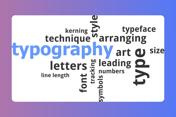
ToggleWhy Typography Is More Than Just Style
Typography directly impacts the way users interact with your website. From headlines to body copy, font choices shape readability and overall perception.
Fonts help establish emotion and personality. A tech startup might use clean, modern typefaces, while a luxury brand may lean toward elegant serif fonts. The tone is felt immediately—even before a word is read.
Because of its importance, many businesses rely on a professional web design company to make sure typography decisions align with both brand identity and user expectations. A good design team understands how font selection affects usability, trust, and conversion.
Readability: The Foundation of Good Typography
If your content is hard to read, users won’t stick around—no matter how beautiful your site looks. Readability should always come first.
Choose fonts that are easy to read on all screen sizes. Mobile, in particular, demands clarity and scale flexibility. Pay attention to spacing (letter spacing and line height), as well as font size. A crowded layout with tight lines can quickly frustrate users.
You should also understand the difference between serif and sans-serif fonts:
- Serif fonts (with small tails on letters) are often used for formal, traditional feels
- Sans-serif fonts (clean and modern) are generally more legible on screens
Each has its place—use them intentionally.
Setting the Right Tone with Fonts
The font you choose says something before your content even begins.
- Rounded, bubbly fonts feel friendly and casual
- Sharp, minimalist fonts feel clean, serious, and high-tech
- Handwritten styles can feel personal or artistic
Smart font pairing can guide visual flow and create contrast—for example, using a bold serif for headings and a light sans-serif for body text.
Great examples include Google’s use of clean, approachable sans-serif typography for clarity and trust, or Vogue’s elegant serif fonts for a high-end editorial tone.
Maintaining Brand Consistency Through Typography
Typography is part of your brand language. The fonts you use should align with your logo, marketing materials, and the tone of your messaging.
If you’re using custom fonts in print materials, try to find web-safe equivalents for your site. Or, consider licensing custom fonts for online use to maintain a unified identity across all platforms.
Also, don’t overlook accessibility. Choose fonts that are legible for all users—including those with visual impairments. Avoid overly decorative styles in body text, and always test for readability.
Typography Best Practices for Web Designers
Keep things simple and consistent.
- Stick to 2–3 font families across your site for clarity
- Use contrast between text and background to enhance legibility
- Choose web-optimized fonts (like Google Fonts) to improve performance and loading speed
The goal is always a balance between aesthetic appeal and usability.
Final Thoughts: Clear, Cohesive, and On-Brand
Typography does more than decorate—it communicates. The right font choices enhance your content, guide your users, and strengthen your brand.
Partnering with an expert web design agency ensures that every font decision—from headline to footer—is deliberate, accessible, and aligned with your business goals. Contact us today!