
Contact form design is one of the most overlooked yet critical elements of a website. A contact form is the bridge between you and your audience—whether they’re trying to ask a question, request a quote, or start a business relationship.
Great contact form design doesn’t just look good—it guides users effortlessly, reduces friction, and ultimately helps you convert more visitors into leads or customers. If your form is cluttered, confusing, or slow, most people will just leave.
In this blog, we’ll break down everything you need to know: what contact form design actually is, why it matters, examples of what works, tools you can use, design principles to follow, and the most common mistakes to avoid. A solid web design agency knows the importance of a good contact form, learn from the best here.
What Is Contact Form Design?
Contact form design refers to how you structure, style, and present the form users fill out to get in touch with you on a website.
It’s More Than Just Fields and a Submit Button
A well-designed contact form isn’t just a list of input fields—it’s a carefully planned interaction that helps users give you the right information quickly and easily.
The Role in Interaction and Lead Generation
Your contact form is often the last step before someone becomes a lead. If it’s hard to find, too long, or visually unappealing, people will hesitate—or bounce. That means missed opportunities. But if the form is well-designed, it becomes a seamless extension of the user journey, encouraging connection.
Balancing Looks and Usability
The best contact form designs strike a balance between aesthetics and functionality. It should look like it belongs on your site and reflect your brand—while also being clean, intuitive, and easy to use across all devices.
Key Principles of Great Contact Form Design
A beautiful contact form is useless if it doesn’t get filled out. Here are the core principles that make a contact form not only functional, but effective.
Simplicity and Minimalism
Less is more. Every field you add creates more work for the user. Keep it short and only ask for what’s absolutely necessary. If you don’t need their phone number, don’t ask for it.
Clear Hierarchy and Layout
Guide the user’s eye. Use spacing, grouping, and alignment to create a logical flow. Fields should appear in an order that makes sense—like name, then email, then message.
Field Labeling: Placeholder vs. Label vs. Floating Label
Don’t rely on placeholder text alone—it disappears as users type. Use visible labels above fields or floating labels that shrink when the field is active. This improves clarity and reduces errors.
Accessibility for Everyone
Design your form so anyone can use it. That means keyboard navigation, screen reader compatibility, proper field labeling, and enough contrast for readability. Accessibility isn’t just ethical—it’s smart business.
Mobile Responsiveness
More than half of users visit websites from mobile devices. Your form should work flawlessly on all screen sizes. Inputs should be large enough to tap, spacing should be optimized, and text should be readable without zooming.
Clear CTA Button Design
Your call-to-action button is the finish line. Make it obvious. Use strong, action-driven text like “Send Message” or “Get a Quote.” Design it with contrasting color and enough size so it doesn’t get overlooked.
3. Best Practices for High-Converting Contact Forms
Want better results from your contact form? Great contact form design is all about reducing friction and making it easier for users to reach out. Here are proven best practices that boost conversions:
Ask Only for Essential Information
People don’t want to hand over their life story. Ask for what you truly need—usually a name, email, and message. The shorter the form, the higher the completion rate.
Use Conditional Logic for Dynamic Forms
If your form has multiple steps or paths, use conditional logic to show only the fields that apply. For example, if someone selects “Request a Quote,” then show pricing-specific questions. Keep things relevant and tidy.
Autofill and Smart Defaults
Speed things up with autofill. Let browsers suggest saved info like name or email. You can also pre-fill certain fields based on known data—like adding the user’s country based on IP.
Real-Time Validation with Helpful Error Messages
Nothing kills conversions faster than a vague “Something went wrong” message. Use real-time validation so users know immediately if something’s off—and explain how to fix it clearly.
Group Related Fields Together
Make your form feel more intuitive by grouping related fields. For example, put “First Name” and “Last Name” side by side. It’s easier to scan and less overwhelming.
Use Progress Bars for Multi-Step Forms
If your form is longer than 4–5 fields, break it into steps. Add a progress bar so users know how far along they are. It reduces form abandonment and makes the process feel more manageable.
4. Contact Form UX Design Tips
Strong contact form design is rooted in user experience. Here are some UX-focused tweaks that can make a big difference in how users interact with your form:
Inline Validation for Better Feedback
Don’t wait until someone hits “Submit” to point out a typo. Use inline validation that checks each field as it’s filled. It saves time and lowers frustration.
Avoid CAPTCHAs When Possible — Use reCAPTCHA Alternatives
CAPTCHAs are annoying. They interrupt flow and can scare off users. If you need spam protection, use invisible reCAPTCHA or honeypot techniques that don’t impact user experience.
Avoid Dropdowns Unless Necessary
Dropdown menus slow people down—especially on mobile. If there are fewer than 5–6 options, consider radio buttons or checkboxes instead. It’s faster and more user-friendly.
Use Microcopy for Context
A little text goes a long way. Add short, helpful messages like “We’ll respond within 24 hours” or “We never share your email.” It builds trust and reassures users.
Place the Form Above the Fold or in Intuitive Locations
Don’t bury your form at the bottom of the page. Put it where users expect it—usually at the top of a contact page, in a sticky sidebar, or as a pop-up triggered by a CTA button.
5. Inspiring Contact Form Design Examples (With Screenshots)
Great contact form design isn’t about cramming in fields—it’s about guiding users through a smooth, intuitive experience that aligns with your brand. Here are a few forms we’ve built that showcase different styles, layouts, and functionality—all designed to convert.
Example 1: Dark Mode Minimalism with High Contrast
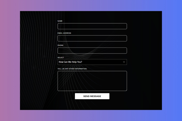
This form keeps it bold and sleek with a dark background, light outlines, and a prominent white CTA button. It’s visually modern, easy to read, and perfect for brands that want to keep things sharp and on-brand.
Example 2: Two-Column Layout with Contact Info Integration
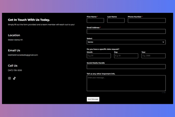
This layout uses a clean split design: the left side offers key business info (email, phone, location), while the right side collects user data with clear, grouped fields. It feels comprehensive but not overwhelming—great for service providers.
Example 3: Light Theme with Soft Accent Button
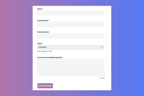
Here, simplicity meets friendliness. The light color palette, rounded input boxes, and soft lavender CTA create a welcoming feel. Great for creative studios or client-focused businesses looking for something warm and professional.
Example 4: Embedded Calendar Booking Form
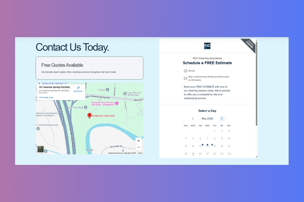
This form skips the usual fields and goes straight to action—letting users book a date and time for a free estimate through an embedded calendar. It’s clean, direct, and perfect for service businesses that want to streamline scheduling.
6. Tools and Platforms for Designing Contact Forms
You don’t need to be a developer to build a beautiful, effective contact form. Whether you prefer drag-and-drop or custom code, there’s a tool for your workflow.
Webflow Form Builder
Webflow’s native form builder gives you full design control without touching code. You can style every part of the form visually and integrate it with CMS items or third-party tools. It’s perfect for custom websites with modern design needs.
Jotform Templates
If you want something ready to go, Jotform offers pre-built templates you can customize in minutes. Choose your layout, tweak the fields, and embed it on your site with ease. Ideal for quick launch or high-volume use cases.
WordPress Plugins (WPForms, Gravity Forms)
Running on WordPress? Plugins like WPForms or Gravity Forms let you build flexible, powerful forms with conditional logic, payment options, and spam protection. They’re perfect for small businesses, agencies, and content-heavy sites.
Elementor and Other Page Builders
Elementor (and similar builders like Divi or Bricks) make it easy to design and place contact forms visually. You can integrate forms directly into hero sections, pop-ups, or landing pages—all without leaving your page layout.
HubSpot and GetSiteControl
These platforms offer form builders that connect directly to CRM tools and automation workflows. Use them when you want to track leads, create follow-ups, or send data to email tools—all while keeping things stylish and functional.
Custom-Coded HTML/CSS
If you want total control, nothing beats building your form from scratch. Hand-coded HTML/CSS forms give you unlimited flexibility for animations, layouts, and performance. Just make sure you implement good validation, accessibility, and responsive design from the start.
7. Advanced Features to Consider Adding
Once your basic contact form design is solid, adding a few smart features can boost functionality and improve user experience.
File Upload Fields
Let users upload images, PDFs, or other files directly through the form—great for job applications, quote requests, or support tickets.
Appointment Pickers / Date Fields
If your service is appointment-based, add a date or time picker. This keeps things organized and eliminates the need for back-and-forth scheduling emails.
Social Login Options
Allowing users to sign in with Google or Facebook can simplify the process and pre-fill key fields like name and email—especially helpful for repeat visitors.
Live Chat Integrations
Pair your form with a live chat option. Sometimes users have quick questions before they’re ready to submit. Giving them an immediate way to connect builds trust and boosts conversions.
Location Fields with Map Integration
Useful for local services—let users select or confirm their location via a map. It adds clarity and makes things easier on your end too.
Hidden Tracking Fields (UTM, Source, etc.)
Want to know where your leads are coming from? Add hidden fields that track referral source, campaign, or keyword. These won’t be visible to users but are gold for marketing insights.
8. Contact Form A/B Testing Tips
No matter how good your form looks, there’s always room to improve. A/B testing your contact form design helps you fine-tune for better performance.
Test Button Color and Text
Try different button colors and CTA phrases like “Send Message” vs. “Get in Touch.” Small changes here can make a big impact on clicks.
Test Field Order and Count
Fewer fields usually perform better—but test it. Try changing the order, removing non-essential fields, or combining first and last name into one.
Split Test Inline vs. Multi-Step Forms
Sometimes a multi-step form feels easier because it breaks things down. Try testing both formats to see what your users prefer.
Measure Form Abandonment Rates
Use form analytics to track where users drop off. If they’re leaving halfway through, that’s a sign something needs fixing.
Track Conversions with Google Tag Manager
Set up events in Google Tag Manager to track form submissions. This lets you tie performance back to specific pages, sources, or campaigns.
9. Where to Place Contact Forms on Your Website
Even the best contact form design won’t perform if no one can find it. Strategic placement is key.
Contact Page
This is the standard—and users expect it. Keep it simple, focused, and include additional info like hours, location, or a map if needed.
Homepage Footer
A footer form lets users get in touch from any page without scrolling back up. It’s non-intrusive and accessible site-wide.
Pop-Ups / Slide-Ins
Used wisely, these can capture leads at the right moment—like after a user scrolls, spends time on page, or shows exit intent. Just don’t overdo it.
Product or Service Pages
Add short contact forms or CTAs to your most important pages. If someone’s interested, make it easy to ask questions without hunting around.
Blog Sidebars or In-Content CTAs
Use sidebars or embedded forms in blog posts to catch leads who want more info—especially on service-related or problem-solving content.
10. How Contact Form Design Impacts SEO and Conversions
Your contact form doesn’t just affect UX—it can quietly influence SEO and overall site performance too.
Page Speed and Mobile Usability
Bulky forms with too many scripts can slow down your site, especially on mobile. A slow page hurts rankings and drives people away.
Impact of Form Placement on Bounce Rate and Engagement
Placing a form in a high-visibility, logical spot encourages interaction and keeps users on the page longer—two things Google loves.
Integrating with CRM/Email Tools
Connect your form to tools like HubSpot or Mailchimp to automate follow-ups and build segmented lists. It’s seamless for users and valuable for your sales funnel.
11. Final Thoughts: What Makes a Contact Form Truly Effective?
At the end of the day, great contact form design comes down to one thing: ease. The easier it is for someone to reach you, the more likely they will. Clean layouts, smart functionality, and intuitive UX turn a simple form into a powerful conversion tool. Whether you’re collecting leads, booking appointments, or answering questions, your contact form should reflect the same level of care and professionalism as the rest of your site.
If your current website—or contact form—feels clunky, outdated, or just isn’t converting the way it should, we can help. As a professional web design agency in New Jersey, we specialize in building fast, beautiful, and high-converting websites tailored to your business. Ready to upgrade your site’s most important touchpoint? Let’s talk.