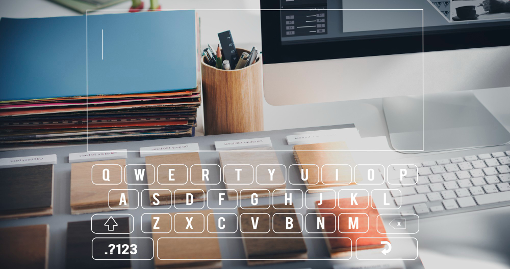
Hey there, digital wanderer! 🌐 Ever stopped to think about the impact of typography in web design? Why some websites feel like a cozy coffee shop, while others feel like a bustling train station? Sometimes, it’s the fonts that set the scene. So, let’s dive deep into the world of typography and its impact on web design. Grab a coffee, and let’s chat!
The Basics: What is Typography Anyway?

A Chill Definition for the Newbies
Typography, at its core, is the art of arranging letters and text. It’s how we ensure content is both readable and appealing. Think of it as the outfit your words wear when they hit the digital runway.
A Quick Trip Down Memory Lane
Back in the day, typography choices were… limited. Remember Comic Sans everywhere? But as web design evolved, so did the impact of typography in shaping our online experiences.
Why Should We Care About Typography in Web Design?
First Impressions Matter, Dude!
Typography isn’t just about looks; it’s about feelings. The right font can set the mood, making visitors feel right at home.
The Unsung Hero of UX
Ever bounced from a site because the text looked like a jumbled mess? That’s the negative impact of typography in web design. On the flip side, good typography enhances readability and user experience.
The Magic of Typography in Enhancing User Experience (UX)
Making Content Scannable
Readability is king. A lesson we learned early on was that no matter how fancy the font, if it’s not readable, it’s not doing its job.
Guiding the User’s Journey
Typography isn’t just about aesthetics; it’s a tool. It guides visitors, highlighting what’s important and setting the tone for their journey.
Setting the Vibe
Fonts have personalities. The impact of typography in web design is evident when you see a playful font on a law firm’s site. It just feels off, right?
Common Typography Mistakes that Kill the Vibe
Too Many Fonts in the Kitchen
Variety might be the spice of life, but in typography, too much spice can spoil the broth. Or, in our case, the website.
Forgetting About Mobile Users
Responsive design isn’t just about layout; it’s also about typography. Fonts that look good on desktop might not shine on mobile.
Sacrificing Readability for Style
Style is important, but never at the expense of readability. It’s a balance, and striking it right can significantly impact web design.
Tips to Nail Typography in Web Design
Keep It Simple
“Simplicity is the ultimate sophistication”- Leonardo da Vinci, especially in typography.
Size and Spacing Matter
The impact of typography isn’t just in the font choice; it’s also in how it’s presented. Proper sizing and spacing can make or break readability.
Color Me Impressed
Contrast is key. Ensure your text stands out but doesn’t scream for attention.
Our Go-To Fonts for Different Vibes
The Professional Look
Arial and Helvetica: timeless classics that never go out of style.
The Creative Spirit
There’s a time and place for fun fonts, but always with purpose.
The Modern Minimalist
For those seeking a modern touch, Futura or Montserrat might be your jam.
Typography is more than just letters on a screen. It’s an art form, a tool, and a silent communicator. Its impact on web design is profound, shaping experiences and telling stories. So, next time you’re online, take a moment to appreciate the fonts.
Bonus Fun Typography Facts
- Comic Sans and Papyrus: love them or hate them, they’ve left their mark.
- Times New Roman’s origin story is as classic as the font itself.

